
Color Your Story: How to Use Color Like a Pro in Your Yearbook Spread
Let’s be real for a second—
Color can make or break a yearbook spread.
The right colors? Your page looks clean, modern, and intentional.
The wrong colors? It looks chaotic, confusing, or like five different vibes fighting for attention 😬
Good news: you don’t have to be a graphic design wizard to use color well. You just need a few smart rules and a little confidence. Let’s break it down.
Rule #1: Pick a Mood Before You Pick Colors
Before you open your color picker and start clicking everything that looks cool—pause.
Ask yourself:
Is this spread fun and energetic?
Serious and meaningful?
Sporty and bold?
Chill and aesthetic?
Color sets the emotion of your page.
Bright colors = energy
Dark tones = drama or focus
Soft pastels = calm, nostalgic vibes
👉 Pro tip: If your spread had a Spotify playlist, what genre would it be? Match your colors to that feeling.
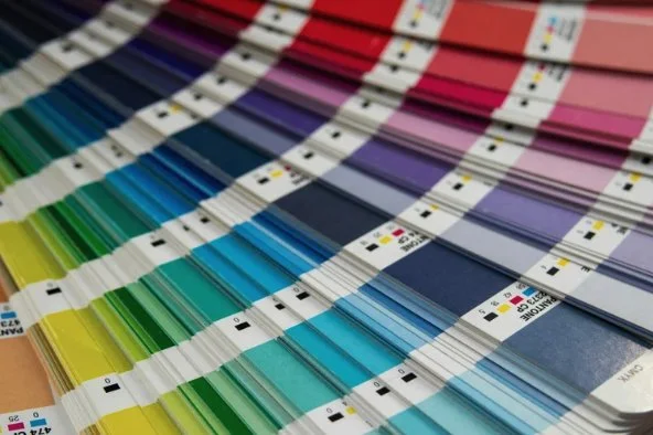
Rule #2: Limit Your Palette (Yes, Really)
More colors does not mean more interesting.
A strong yearbook spread usually sticks to:
1 main color
1–2 accent colors
Black, white, or gray for balance
When you use too many colors, nothing stands out. When you limit your palette, everything looks intentional—like you actually knew what you were doing (even if you were winging it 😎).
Rule #3: Use Color to Create Hierarchy
Color isn’t just for looks—it’s for guiding the reader’s eyes.
Use color to:
Highlight headlines
Separate sections
Emphasize quotes or captions
Your reader should instantly know:
“What do I look at first?”
“What’s important here?”
If everything is the same color… nothing feels important.
Rule #4: Contrast Is Your Best Friend
If your text is hard to read, your spread already lost.
Always check:
Light text on dark backgrounds
Dark text on light backgrounds
Avoid neon-on-neon (your eyes will hate you)
If you have to squint to read it—change it.
Yearbooks are meant to be looked at years later, not decoded like a puzzle.
Rule #5: Color = Consistency Across the Book
Your spread doesn’t live alone—it’s part of a bigger story.
Try to:
Match or complement colors used in nearby spreads
Stick to the section’s color theme
Keep things cohesive across the book
This makes the entire yearbook feel polished, not random.
Bonus Tip: Trends Are Cool… But Don’t Overdo Them
Muted tones, monochrome spreads, retro colors—they’re all trending. But trends fade.
Ask yourself:
“Will this still look good in 10 years?”
Classic color choices + modern layout = the sweet spot.
Final Takeaway
Color isn’t about following rules—it’s about telling your story visually.
When you:
Choose a mood
Limit your palette
Use contrast and hierarchy
Stay consistent
You don’t just design a spread…
You design a memory.
And that’s what yearbooks are all about.